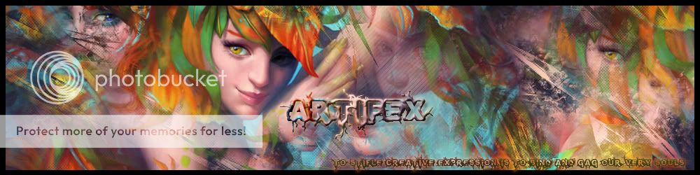
Ok catching up from my last critique..

+: I think your ability to create things amazing, I love the colours and symmertry of the animation.
-: The flow of the initial punch is almost just a tad quick for me though I am looking at this with tired eyes will look again tomorrow.
Not really sure how to critique animated works so I stuck the basics until I learn ;p
_____________

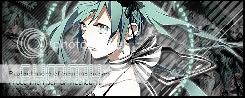
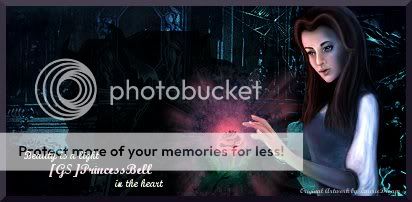
+ : I love the composition of this piece, how even though the text is placed down the bottom it still balances the piece out perfectly. The colours and positioning of the female along with the text choice illuminate a sense of elegance and a bit of mystery too.
- Her face is a little dark, mostly due to the image used but it might be aided with a lighting or more definition to the face at least in the parts lighted. The background while really nice when connected with the main image creates a sense of clutteredness, perhaps a less patterend background?
Overall I really liked the signature and found it hard to critique it.
___________
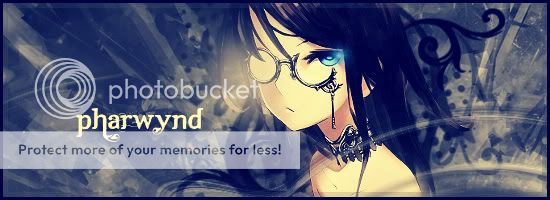
+ The image has been taken for a sci-fi grunge spin and then pasted down, the messyness of the background and the symmetry of the image and text circle is like an eery pretence almost like a scifi where the future gets it wrong (oh wait isnt that most sci-fis?) - This is a good thing ^_^
-: the text used for the word "Gummy" is a little hard to read, perhaps another futuristic font may make this clearer?
Lumiere your piece like a lot of work is so unique and very you =)
____________
+ An ominous shadow of a beast cast upon belle and the rose is a fantastic concept, the contrasts that this creates allows for the darkness and beauty of the situation at hand. I particular liked the lighting used on the rose and bell to emphasise the focus.
-: The text is like you mentioned was the first break I found with the flow, while it is a nice text I am not sure that it suits, perhaps a gothic text? I might suggest
Black Rose for [GS]PrincessBell and returning to a basic font (curvish base) for the smaller text to emphasise the name and then the quote.
Overall smexy piece =)
_________________
Would just like to say hiya Jathy ^_^ nice to have you posting with us again, and I did ipdip on which one I would critique for you...

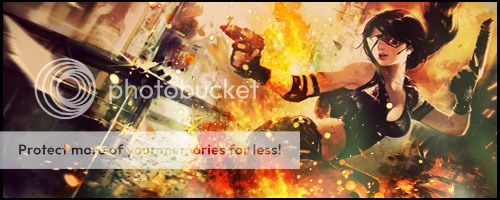
+: Composition of this piece is really nice, the placement of image, background and text works well together. Your colour choices also allowed for the pieces to connect to one another.
-: As it is a premade I am uncertain as to whether the text will stay the same so I will leave it alone. I love your work but although in this piece the colour does connect them there is little else to draw the piece together, maybe if the sea-anemone was partially in front of nemo or another marine/coral life was partially in front two. Not sure =)
Had to pull hard on this one to find something to critique....
___________________
Not sure if I will take it further but its my newest piece