It is fantastic to see people posting up their works for critique but we need to critique as well, or we have an (while rather smexy) art gallery instead of a critique thread designed for learning.
I however am enjoying the descriptions of how you have taken the next step in your works based on critique in the previous thread =), and everyone is utilizing it so well
For PrincessBell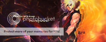
Contrasts... you either love it or you hate... I am a lover of contrasts =) So I find this piece rather appealing in that respect. The balance and flow of the piece makes it easy to view and your eye glides to all the right places.
The text while occupying the space is good, it is blurry and hard to make out. (The script while elegant could be changed to a easier to read font if you wish to keep the size, or increasing the darkness around the text/eliminiating any "auras/glow" that are inhibiting the reading of it)
The rendering of the man's head seems out of place with the white "aura" around part of his head... perhaps positioning further right so that his head sits within more of the "brighter" colours or removing the aura entirely.
~+~
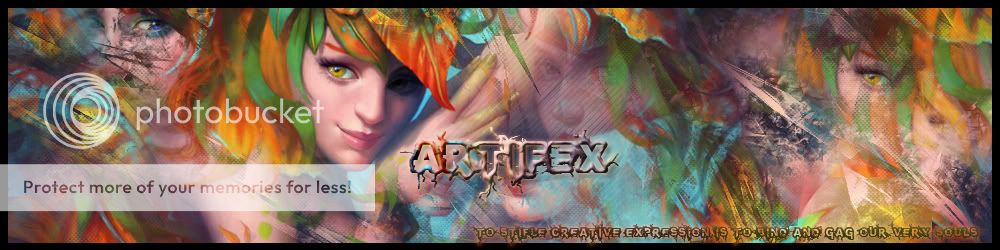
For Mathy
I love the softness of this piece, its colours and symmetry give it an overall peaceful and a quite femine look (in the good way =p).
While I agreed with Spirit about the face being a little blurred in the previous version, I find that in this one it is a little too sharp, in particular to the fringe. It might be possible to select only the face for sharpening, leaving the hair unchanged.. It might also create the face/eyes as even more of a focal point.
Overall both pieces = smexy =)
p.s 300th Post! Wootsies o.o


 _
_ _
_