|
|
| Author | Message |
|---|
Pharwynd

Modi Master
Founder

Posts : 774
Join date : 2010-07-24
Age : 36
Location : Victoria, Australia
 |  Subject: First Draft Subject: First Draft  Thu Dec 08, 2011 2:03 pm Thu Dec 08, 2011 2:03 pm | |
| Introduction:"Please present in posts below your pieces to be critique and/or your constructive criticism of other pieces presented. These threads are designed to assist and help artists improve, learn and gain confidence in their work and presentation of said work. Anyone who does not abide by the rules of this forum, Signature Rules and/or the rules of our critique section will be met with swift action of which in some cases will equal an immediate ban." This is the First Draft Thread!! In here will be the first place you are to present your work, from here you will also recieve constructive criticism about said piece. After that you are welcome to ignore said advice, work on your piece with that advice and no more or present again in the next thread for further critque =) The choice is yours, our hope is that people will find this a fun, interesting and learning experience. If any one has any problems or concerns feel free to PM Pharwynd or spirit9123. So I invite everyone to participate in this section as both a presenter and a critiquer, and most importantly... have fun and stay creative =) For a full explanation of the Critque Section, Rules and more please follow this linkLink to Second Draft for your smexy revision piece ^.^EXAMPLE:You are welcome to use your own structure/format as long as the Yin-Yang rule of equallity is maitained (as well as following all the other rules) and your criticism is CONSTRUCTIVE. { Cyan= Optional but highly recommended} - Quote :
- Basic Critique Structure
 _ _ _ _
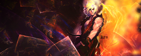
Chosen Piece: Batman by Pharwynd
1)(Compliment): I liked the water effect
Explanation: because it made it look like he was actually hitting the water, also the “flatness” of the water fitted in with the lego/painted like look.
2) (Critique): I didn’t like the water effect
Explanation: because it ends on the sides and some places at the bottom causing it to float, and become more of an effect rather then batman actually hitting the water.
Suggestion: Revision of the piece in respect to water effect
Links: http://tutorialsofawesomeness.com/watereffect
Piece for Presentation:
 |
|
  | |
Princess-Bell

Posts : 29
Join date : 2011-10-05
Age : 34
| | Subject: Re: First Draft Mon Dec 12, 2011 12:27 am | |
| |
|
| | |
Lanaee

Founder
Sleeping

Posts : 175
Join date : 2010-07-24
Age : 33
Location : US
| | Subject: Re: First Draft Fri Dec 16, 2011 1:06 am | |
| Yay! Finals are done! So I've been testing my skills and am determined to try out some new things..we'll see how that goes. Anyways, here's my latest attempt at a sig. Just a random one.   |
|
| | |
Pharwynd
Modi Master
Founder
Posts : 774
Join date : 2010-07-24
Age : 36
Location : Victoria, Australia
| | Subject: Re: First Draft Fri Dec 16, 2011 5:42 pm | |
| 1) PrincessBell[Heya Hun, I have already basically critiqued this with you earlier so I got my BF to help so part of this is his opinion ;p] * I love the elven girl you used =) The angling and rendering is fantastic adds a sense of depth. * The Contrast between the two colours of (maroony) purple and green and a mystical/fantasy feel to the work that is pleasing to the eye. (mine at least ;p) * The brush work on the background (producing the vines) while pretty is a bit busy, particularly with the inclusion of the text. --- Maybe making the brush work transparent or a lighter green colour will make it a little less busy or removing the text altogether * If this was intended please ignore^^ but parts of the brush extend the boundries of the signature and appear cut off. ---If on purpose, maybe make the edges a bit rounded, or cropping it back to the boundries of the main background. 2) Lanaee* I like the cool colours of this signature, makes the ambience peaceful and relaxed, and the shiny look gives it a modern appeal. * the slight off centred balance of the central figure almost gives a sense of movement as if she is dancing/swaying to the music. * Lack of or not enough border, I am not sure why but when I look at the signature I feel as if it needs framing, even slightly, especially if it is to be on a white background --- Smexy border to frame the smexy work ;p * I am a sucker for dots but the white ones behind the girl I am not sure about, maybe too dominant? (not much help lol I know ) I really look forward to seeing how and where you will take your pieces =) My Art for critique is a bit different ;p, but not only signatures can be submitted here^^. I am working on a Flag banner for the guild LOST on Teos & Lailah. Let me know what you think ( In the end it will be resized for use on a profile.)  |
|
| | |
Harajuku

Modi Master
Posts : 100
Join date : 2011-09-22
Age : 29
Location : US
| | Subject: Re: First Draft Fri Dec 16, 2011 11:23 pm | |
| Pharwynd; I really like the flag, looks really neat and clean.
But the text looks kind of bad, I don't know what to call it but looks like lines are in it.
|
|
| | |
Princess-Bell
Posts : 29
Join date : 2011-10-05
Age : 34
| |
| | |
Mathy

Modi Master
Posts : 280
Join date : 2011-09-22
Age : 26
Location : Warsaw, Poland
| |
| | |
spirit9123

Modi Knight

Posts : 55
Join date : 2011-10-04
Age : 37
Location : United States
| | Subject: Re: First Draft Sat Dec 24, 2011 12:25 pm | |
| The background looks nice, the grunge effect gave it a pretty nice flow But the render kinda just stops...It might be best if you added in a slight border to the bottom area to help make the render not seem like it is just stopping I'd suggest looking at This tutorial by Harajuku on Borders to fully understand what I mean since...I believe I worded it very badly lol  |
|
| | |
Mathy
Modi Master
Posts : 280
Join date : 2011-09-22
Age : 26
Location : Warsaw, Poland
| | Subject: Re: First Draft Mon Dec 26, 2011 5:17 am | |
| oh i know how to make that border o.o i just thought it would be pointless since the site background is black lol |
|
| | |
spirit9123
Modi Knight
Posts : 55
Join date : 2011-10-04
Age : 37
Location : United States
| | Subject: Re: First Draft Wed Dec 28, 2011 11:18 pm | |
|  The colors blend together quite well -but i think the contrast is a bit high ~Maybe try to lower the contrast of light and darkness? (what i like doing when i feel something is over contrasted, I add a layer on top that is filled with white, and put its opacity to 10%/Normal) You have created a wonderful flow -but there is a lot of empty space on the left side, a little on the right, and a tiny bit on the top. ~Maybe try cropping it down a little on the sides? as for the top, crop it to where just a tiny amount of his head is cut out?(maybe) 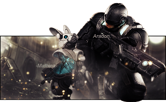 (don't mind the white around the edges, it is meant for a white background - [click here to see it on white background] |
|
| | |
Mathy
Modi Master
Posts : 280
Join date : 2011-09-22
Age : 26
Location : Warsaw, Poland
| | Subject: Re: First Draft Wed Jan 04, 2012 3:17 pm | |
| like i said in the shaiya thread
nice depth and effects,
but the text is tiny and i don't like the render o.o
maybe it would look better with a different font? (tried to make a different popout than usual o.o) |
|
| | |
Lanaee
Founder
Sleeping
Posts : 175
Join date : 2010-07-24
Age : 33
Location : US
| | Subject: Re: First Draft Thu Jan 05, 2012 11:57 am | |
| So here is a signature I made using some new brushes. Let me know what you think!
(don't forget, everyone needs at least 1 comment on their work before they can progress to the second thread. So please comment on those who need the comments to progress!!)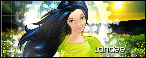 This one was stripped of its color and re-colorized. I'm not sure I like it but it was fun trying to color it. 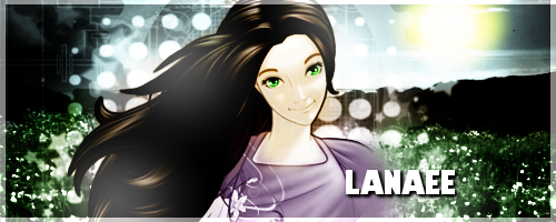
Last edited by Lanaee on Thu Jan 05, 2012 1:53 pm; edited 1 time in total (Reason for editing : edited for comment clarificatin) |
|
| | |
spirit9123
Modi Knight
Posts : 55
Join date : 2011-10-04
Age : 37
Location : United States
| | Subject: Re: First Draft Thu Jan 05, 2012 4:33 pm | |
|
I'm not going to lie...I really like the re-colorized version over the original  it gives it a nice smooth look and helps it all blend much better i think. it gives it a nice smooth look and helps it all blend much better i think.
-- The one issue with the re-colorized one is it seems too high contrast, maybe u can find a way to lower the contrast ever so slightly?
on the original one i like how the shirts kinda glowing and it reflects off on her hair
-- but the re-colored one seems to lack it, i thought it is a really nice effect, if u can put it onto the re-colored one i think it would look great!(just keep the effect low, not as powering as it is on the first, since the second one is more of a soft, contrasting feel)
The text on them both is pretty nice, easy to look at and easy to read
-- but the sun on the first one seems too static, like its just....there, if u could do what u did to the second one to the first one for the sun, i think it would look pretty good 
The lighting effects overall seem really well done on both of them (aside from that sun from above, but still seems very good and accurate)
--but the image seems somewhat flat, maybe use that star (brush?) u used and add very few stars a little in front of your render? (this ones just an idea...not sure if it will work well or not )
____________________________________________________________________
This one i like, due to the nature of the render, the center focal really helps it out, the render is very symmetrical for the most part along its outline
--The one thing i think may make it better, is...you see where the bottom of the hand is cut off? that slight little part, i think it would look better if u had that part OVER the border, as if she is sticking her hand outside of the siggy (even if it is slightly)
I also love the positioning and font of the text, it really matches the "bat/vampire" type theme the girl has with those wings.
--but i think the color kind of pulls too much attention to them, maybe make them one of the pink shades? (not 100% this will look great, but may work, if not, and u repost in the second draft, i 'might' repute what i just said and have u change it back to blue )
I LOVE how you got the lighting on it dead on! AND you used the lighting to help with the flow of top-left-> bottom right, really sneaky and clever 
--But the render looks slightly blurred in the face, maybe sharpen it a TINY bit? (just the face though) |
|
| | |
Pharwynd
Modi Master
Founder
Posts : 774
Join date : 2010-07-24
Age : 36
Location : Victoria, Australia
| | Subject: Re: First Draft Thu Jan 19, 2012 2:58 am | |
| Okie dokie going to do the ones I havent already done^^ [NOTE] On the subject of versus... I like the top one but then again I am a sucker for contrasts and bolds... (plus its disney like >.>) and on that note I shall rate the bold one ;p(I feel Spiriit covered the other well =) ) The warm colours give that warm fuzzy tingling feeling... like we can actually feel her happiness. The slightly off centred positioning also gives it a sense of realism (Perfection / Symmetry is often something associated with computers, and while can also be beautiful can also seem posed.. ) I am unsure about the technology aspects to the signature (computer based lines and cogs), they look snazzy but unsure if they fit with the look (unless its about technology taking over nature then ill just be quiet...). The white line on the left hand side has made an artificial border which especially on this black background makes it seem like its the border and not the border it self. My only suggestions would be to move the line off maybe so that the image continues passed the borders and uses the border it self to contain it and keep making smexy work ;p __________________________________________________________________________________________________________ The image is well blended and the effects while noticiable offer subtly that meld the image together well. The "Pop out is effective as it appears as if the subject is stepping(/running) out of the image making the popout flow and still feel "one" with the piece. Only thing I would mention is that the 2nd subject/s are unclear when they become part of the background and not a pop out.(I am getting my eyes checked soon so it may just be me). Similar problem with the text Mathina, I agree text shouldn't always (some believe never) should be big enough to attract attention, But the word isnt overly clear and if I did not know already about Aragon and Mathina I am not sure I would have caught it first glance. If any of what I said was not intentional making things clearer (doesnt have to be by sharpen) and maybe brightening the text for mathina might assist. Another alternative is to Ignore me entirely XD _________________________________________________________________________________________________  Something I worked on last night and think it might be fun to continue but not sure where to go from here so thought I would put it here for all your lovely comments and help =) Just something fun |
|
| | |
Princess-Bell
Posts : 29
Join date : 2011-10-05
Age : 34
| | Subject: Re: First Draft Tue Jan 24, 2012 2:13 am | |
| |
|
| | |
Pharwynd
Modi Master
Founder
Posts : 774
Join date : 2010-07-24
Age : 36
Location : Victoria, Australia
| | Subject: Re: First Draft Sun Jan 29, 2012 3:42 pm | |
| 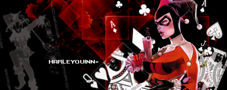 Well I am a colour person if people havent already figured out and Red, Black and White is one of my favourite colour combinations XD. I Also like the flow of the piece, the positioning makes your eyes wander the length of the signature so a good use of space and flow. The Jester on the left hand side, while balancing the piece colour wise feels detached from the rest of the image, possibly extended the artwork/brushes a bit further to "touch" the other might make it feel more connected. Not sure if you used a thin black border or not but in this case i think a more dominant border (same thickness or "thin") would add to the piece possible a dark red? Well I am a colour person if people havent already figured out and Red, Black and White is one of my favourite colour combinations XD. I Also like the flow of the piece, the positioning makes your eyes wander the length of the signature so a good use of space and flow. The Jester on the left hand side, while balancing the piece colour wise feels detached from the rest of the image, possibly extended the artwork/brushes a bit further to "touch" the other might make it feel more connected. Not sure if you used a thin black border or not but in this case i think a more dominant border (same thickness or "thin") would add to the piece possible a dark red?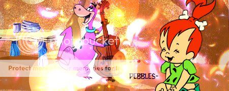 1 word CUTE! This piece again has great flow, your eye is led around the piece. The colours, brushes and/or effects are vibrant and reaffrim the happy and almost festive feel portrayed by the main figures. The use of the "Bubbles" also did well to add depth to the piece.I do not know why (but probably a rule of thirds.. spirit can explain better maybe o.o) but my eyes are drawn 1st to Dino then the word pebbles and then Pebble herself, Firstly it would be interesting to see if that happens to anyone else, if so maybe (if you dont want dino to be the first sight) bring Pebbles over a bit or make more dominant unsure again it could just be me. Pebble also feels a bit displaced from the rest of the scene, possibly using an effect/brush similar to what is already used in the piece and place it slightly on the fore ground in front of her (not on top to the side etc) might bring her together with the piece.p.s why does everyone skip my siggies =( / art EDIT: I made a siggy o.o 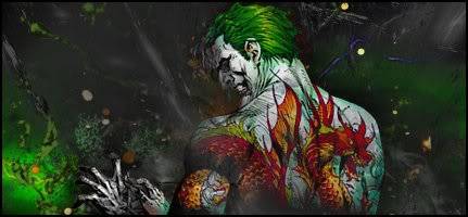 Its already in my premade thread for people to request but always looking for tips ;p |
|
| | |
Princess-Bell
Posts : 29
Join date : 2011-10-05
Age : 34
| |
| | |
KVerity

Posts : 12
Join date : 2012-02-13
Age : 33
Location : Bendigo
| | Subject: QUESTION BY THE NOOB! Mon Feb 20, 2012 7:16 pm | |
| I know that signatures are a big thing here, and I'd love to start making some, but I have literally no experience with it.
I do however enjoy fashion design on my computer... Is that something I'd be able to post here? Or should I get started on some signatures?
PS, I have no where near the talent that my amazing sis has... |
|
| | |
Harajuku
Modi Master
Posts : 100
Join date : 2011-09-22
Age : 29
Location : US
| | Subject: Re: First Draft Mon Feb 20, 2012 7:20 pm | |
| - KVerity wrote:
- I know that signatures are a big thing here, and I'd love to start making some, but I have literally no experience with it.
I do however enjoy fashion design on my computer... Is that something I'd be able to post here? Or should I get started on some signatures?
PS, I have no where near the talent that my amazing sis has... You can post anything you want here that you have made(: |
|
| | |
KVerity
Posts : 12
Join date : 2012-02-13
Age : 33
Location : Bendigo
| | Subject: Some of my Clothes Mon Feb 20, 2012 7:58 pm | |
| |
|
| | |
Princess-Bell
Posts : 29
Join date : 2011-10-05
Age : 34
| |
| | |
prince1999

Posts : 28
Join date : 2012-02-18
Location : Paisley Park, USA
| | Subject: Re: First Draft Thu Feb 23, 2012 12:17 pm | |
| I'm impressed with both your designs and also your coloring technique, KVerity! These are really nice. Believe it or not I actually dabbled in some fashion design when I was younger as well.^^ I would suggest altering your base model so that you have a standard template that includes both front and back views. That will help you to visualize the design more completely. (where will the zipper go? hehe) If I find time, I'm gonna see if I can find one of my old drawings to share P.S. I'm tickled by how she turned into a fox haha <3P.P.S. hi, Bell ^^ EDIT* Okay I couldn't resist, I went and found this old drawing. The quality might stink a bit, but it's a good example of how thinking of various perspectives can really help you make a full design. Just a suggestion for you to consider in the future, because clearly you have an eye for details. I love the buckles and snaps you put on the denim pieces. EDIT**[.img]took the pic down so I don't have to worry about it floating around cyberspace^^.jpg[/img.]** --------------------------------------------------------------------------------^^^ the 3/4 view was always just an extra option when I was playing around. Front and Back only gives a very nice dynamic.
Last edited by prince1999 on Sat Feb 25, 2012 9:21 pm; edited 3 times in total |
|
| | |
Pharwynd
Modi Master
Founder
Posts : 774
Join date : 2010-07-24
Age : 36
Location : Victoria, Australia
| | Subject: Re: First Draft Fri Feb 24, 2012 5:44 pm | |
| Since my sister gets my critique all the time and no pieces have been presented bar my sisters since mine I guess its time to present a piece for critiquing (Remember to stick to the yin yang formula) 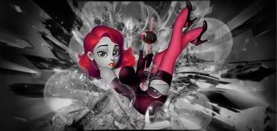 Been getting into noirish colour splash for a while this is one I made a few weeks back |
|
| | |
prince1999
Posts : 28
Join date : 2012-02-18
Location : Paisley Park, USA
| | Subject: Re: First Draft Fri Feb 24, 2012 6:01 pm | |
| your work is always so nice, it's hard to find things to say you could improve lol >.< With this one I really like it overall. The subject is gorgeous, the colors are obviously fantastic, and the background gives really nice movement. The downside is (and maybe this is just me) but I find the details in the very center get a little... unclear. It's hard for my brain to figure out what her hands are doing, and what that little, dark ball above her hands is. Were it my piece, I think I would remove the dark ball and maybe even modify the position of her hands. (potentially even removing her arms from the picture - giving the impression they're hidden behind the bubbles - in the process enhancing that smexy curve of her belly.) But, again, that's just me |
|
| | |
prince1999
Posts : 28
Join date : 2012-02-18
Location : Paisley Park, USA
| | Subject: Re: First Draft Sat Feb 25, 2012 12:21 am | |
| Okay my turn I guess Not sure how a critique will work with animated ones where the quality always suffers and I don't have much wiggle-room. But I'm totally open to any and all observations. (even "it'd be cool if you had room to ___") LOL! I'm fine with the idea of trying to squeeze another thing into the 4kb I have left ^^ (Or just listen to things that bother other people about it to know for the future. Always interesting to hear other people's opinions.)  P.S. Once I get my studio I can probably post other versions I wish I could use |
|
| | |
Sponsored content
| | Subject: Re: First Draft | |
| |
|
| | |
|