uberfearr

Posts : 91
Join date : 2012-07-29
Age : 31
Location : United States
 |  Subject: How I Make My Sigs Subject: How I Make My Sigs  Sun Aug 26, 2012 1:46 am Sun Aug 26, 2012 1:46 am | |
| Since I opened my siggy shop, I've received various questions about my siggies, like where the renders come from, how I achieve an effect, how I go about making them, etc. So here I'll post up a quickly drawn out guide on how I go about making my signatures, for anyone interested. Feel free to ask any questions, if I don't cover them. :] This is very long, a lot of reading & little pictures, just a warning - this is not intended for beginners  [You must be registered and logged in to see this image.]1) I start by picking out a render that inspires me, usually with a color scheme that appeals to me. I love oddball color schemes. I generally try to stay away from black+red, black+white, too much of one color, or renders with a hundred different colors. [You must be registered and logged in to see this image.]1) I start by picking out a render that inspires me, usually with a color scheme that appeals to me. I love oddball color schemes. I generally try to stay away from black+red, black+white, too much of one color, or renders with a hundred different colors.
I'm using [You must be registered and logged in to see this link.] one.
2) Next I open up Photoshop, and create a new document. I like to work with 500 x 200 px just cause it gives me room if I want to make a pop-out, but generally I like to stick to any size around 380 x 180 px.
3) I start out by making a shape using the Rectangle or Custom Shape Tool. For this siggy, I'm using a [You must be registered and logged in to see this link.].
4) Now I open up the render and drag it into my sig document. I usually have to resize here. I then clip (Ctrl+Alt+Click) it to the shape. If you're doing a pop out, you can skip clipping the render. Read more on making a pop out siggy [You must be registered and logged in to see this link.].
5) Since I'm doing a pop-out, I duplicate the render, place it above the clipped render layer so the duplicate isn't clipped. I select the inverse of the shape (Ctrl+Click shape then Ctrl+Shift+I), use the Lasso tool while holding Alt to select around the area I want to pop out and clear the duplicated render. This step can be skipped, I do this to achieve certain effects, it's just a force of habit.
6) By now this is what I call my 'base siggy.' No extra effects or anything. Basically a blank canvas.
- Spoiler:
[You must be registered and logged in to see this image.]
7) Moving on, it's time to find a background I like. I have a whole folder of digital wallpaper sized images. Most are straight up wallpapers from games like Aion, Guild Wars, etc. I often use more than one background image, stacked on another to achieve different dimensions. I try to pick background images with distinct things in it, like a tree or city. It doesn't matter too much what the color is or really what the image is, because it's opacity will be brought down so much, cities or other things in the image wont be recognizable and the color can be quickly changed by changing the base shapes color, or adding a Hue/Saturation adjustment layer. 8) This is the effect for the background I decided to go with. Of course, by the time I'm done adding effects and lighting, it wont be as prominent. I may even tweak it some later on in the siggy. I set BG1 to Soft light @ 63% opacity, and BG2 at Soft light 100% opacity and set the shape background color to #201f4b. If the background is too bland or I'm trying for a certain look, I'll use brushes ontop of the background, like smudge grungy or paint splatter brushes. - Spoiler:
[You must be registered and logged in to see this image.]
9) Now I'll crop the document a little so there's not so much extra space (not that it'll matter in the end result). And fix a few little details. For example, I don't like how prominent her skirt looks, so I'm going to erase and smudge it some to blend in with the background a bit. Add a border, in this case, the typical contrast border. For more info on how to make borders, click [You must be registered and logged in to see this link.]. This is what it looks like so far: - Spoiler:
[You must be registered and logged in to see this image.]
10) Looking on it now, I don't like how her lighting is. So I'll play with adding a Curves and an Exposure Adjustment layer, clipped to the render, to play around with the shadows and highlights to have the render fit in better with the background. I also added two Gradient Map adjustment layers over the entire siggy to change the lighting a bit and add more depth. I used the 'Sepia-Blue 1' from the Photographic Toning gradients, and above that layer, the 'Red, Violet, Yellow-Green' from Color Harmonies 1 gradients, both set to Overlay or Soft Light. I'm pretty sure the Photographic Toning option is only available in CS6, though someone might have replicated them and put them on dA for use on lower versions.
Moving on, I won't bother posting an update because the changes aren't that crazy. Just subtle lighting changes. Anyway, this is the next tier of my siggy making process. I've already created my base siggy, messed with the lighting and overall 'tone' of the sig, now comes the actual effects. Here's where the layers get insane. I never name them, but I'll try to keep up with it for the sake of this guide.11) - Soft Lighting Brushes: After I complete the first two tiers in my sigs, I move on to using soft round brushes in various colors and blending modes to add to the lighting. - Spoiler:
[You must be registered and logged in to see this image.]
12) - Bokehhhh! Ahh [You must be registered and logged in to see this link.].. those amazing blurs of lights. I use it in almost all of my sigs. It just adds such a soft, nice quality to the siggy. I usually only use lighter colors, similar to spots on the render. Although I've seen people use them in ways that stand out a lot and looks great, I've yet to master that though. Anyhoo, from here I'm adding bokeh in spots I like, and once again, various colors and blending modes, and each bokeh on a different layer. A thing to keep in mind with bokeh is to use it in moderation, and make it flow well. Imo, bokeh looks best when coming from a single point on the siggy, i.e. having it come from the top left corner, down to the bottom right, or in a half circle near the render. I like to have a few spots going over the render. I'm not worried about what has leaked over the siggy, into the white. I'll clean it up when I'm done with the siggy. Bokeh brushes [You must be registered and logged in to see this link.]. - Spoiler:
[You must be registered and logged in to see this image.]
13) - Light Spots: Now I'm gonna add bright light spots. I can do this manually, but I like to use a [You must be registered and logged in to see this link.] for ease, and just erase what I don't need. Again, I like to keep a flow here, not just add them all over. In this case, I'm focusing them around the render. - Spoiler:
[You must be registered and logged in to see this image.]
14) - Filler: What's filler? It's anything I use to fill up space. Sometimes is floral, swirly type brushes, sometimes it's text and lyrics, other times it's lower opacity duplicates of the render. In this case I'll be using decorative text filler, since the background has enough going on that adding swirls would make it look busy. I don't usually add more than 1 layer of decorative background text, otherwise, once again, it can look busy. - Spoiler:
[You must be registered and logged in to see this image.]
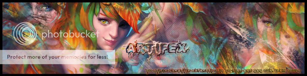
And here's the end result (you saw it at the top). I cleaned it up, gave the shape background a dotted stroke (did I mention I love CS6?), added a drop shadow to the shape, and removed the white.
[You must be registered and logged in to see this image.]
Just for fun, here's what my layers ended up looking like. That's why I crapped out showing you guys toward the middle there.
- Spoiler:
[You must be registered and logged in to see this image.]
Last thing to do is add text, which honestly, is anyone's game. Idk who this is going to so I skipped this but I generally pick the two colors used the least in the sig, that would also stand out against the background and use those for the name and guild/quote. Then add a little bit more decorative text in a small quantity. Like that super tiny unreadable text that just looks like a bunch of semi-dashed lines, or some unreadable script, and plop it behind the main text. Hope this helped anyone 
Last edited by uberfearr on Mon Sep 10, 2012 11:49 pm; edited 2 times in total |
|
Mathy

Modi Master

Posts : 280
Join date : 2011-09-22
Age : 25
Location : Warsaw, Poland
| | Subject: Re: How I Make My Sigs Sun Aug 26, 2012 11:23 am | |
| I love you for this. :3
I love your sigs so much QQ I'll never be as good as you, even with this tutorial memorized >.> |
|